
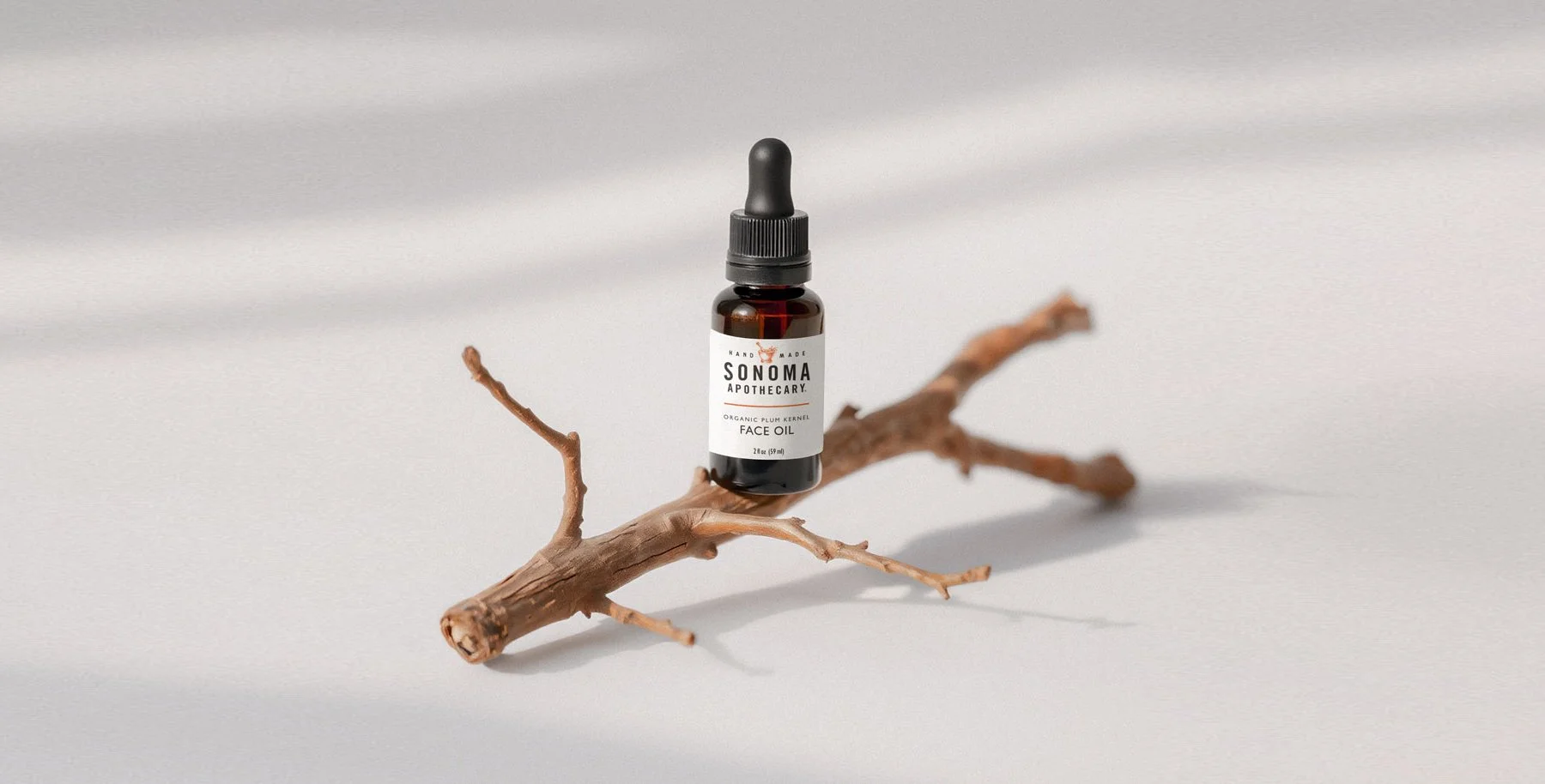
Brand Identity · Packaging Design · Art Direction · Product Labeling
Sonoma Apothecary
The Challenge
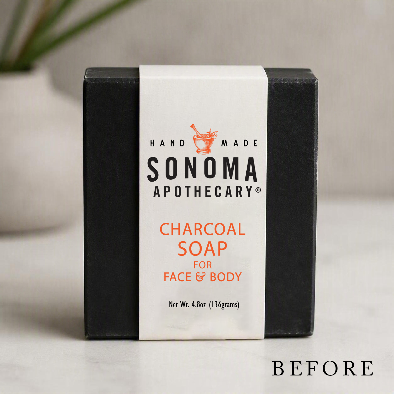
The existing packaging lacked consistency across product formats and made it difficult to establish a recognizable shelf presence.
Key challenges included:
Multiple product categories requiring a unified visual system
Inconsistent typography and label structures
Limited hierarchy between brand, product, scent, and benefit messaging
Need to accommodate different container sizes and formats
Creating distinction between traditional body care and CBD product lines
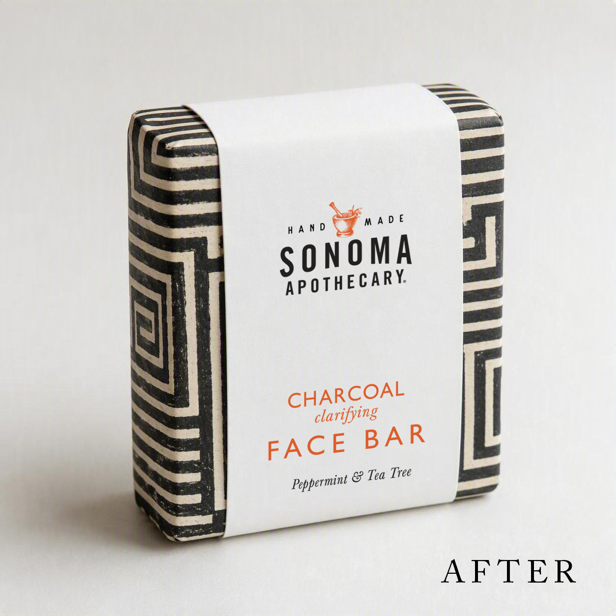
The goal was to develop a scalable packaging system that felt modern, clean, and premium while remaining approachable and rooted in natural wellness.
My Role
Brand & Packaging Designer
Responsibilities included:
Label redesign and production artwork
Brand identity refinement
Packaging system development
Product hierarchy strategy
Typography selection
Color and fragrance differentiation
Print-ready production files
Brand standards documentation
The project included redesigning numerous SKUs across body care, CBD wellness, and specialty products, along with creating supporting brand assets and logo files.
Outcomes
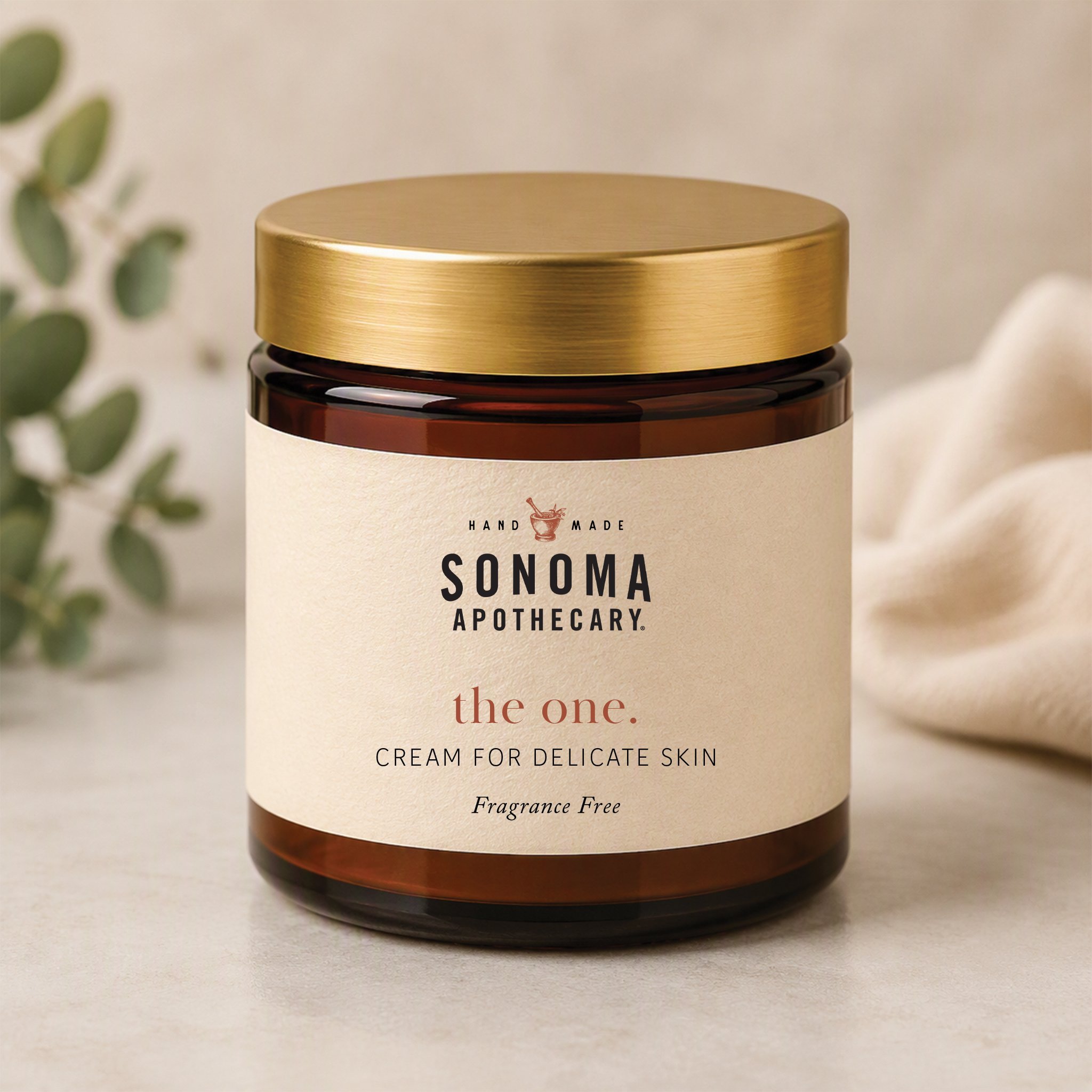
A cohesive and recognizable packaging family
Improved product organization and hierarchy
Stronger premium positioning
Scalable design standards for future growth
Consistent branding across dozens of product SKUs
The updated packaging helped Sonoma Apothecary present a more polished and professional brand experience while maintaining its commitment to natural ingredients, handcrafted products, and wellness-focused formulations.